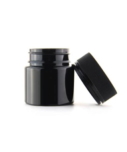
Packaging design trends are an interesting thing. Some burn fast and bright, then disappear ...... while some stand the test of time. Either way, you should be aware of them when developing your Cannabis Packaging. And, the most important thing to remember is that the only design trends worth embracing are the ones that actively support your brand.

Cannabis Packaging
This means you'll probably leave most design packaging trends behind. And, that's okay. So, here are a few trends we think will stick around for a while:
Rich imagery
While cannabis leaves can be very cliché, when you use leaves on cannabis packaging, it's also the fastest way to make cannabis products recognizable.
And, many successful cannabis logos and packaging graphics incorporate the iconic leaf in new and modern ways.
In fact, the cannabis leaf is so recognizable that you can even change its color while still maintaining its effectiveness. So don't be afraid to experiment and get creative.
Environmentally friendly packaging
Today's consumers are more environmentally conscious than ever before.
Shoppers care about whether products are good for them and the environment. That's why "organic," "sustainable" and "virgin" products are now in demand.
And this desire to minimize environmental impact extends beyond the realm of packaging. Not only should your cannabis packaging be sustainable, it should also look sustainable. The soft hues of natural colors help communicate how natural your product is.
Focus on health
Medical marijuana patients have health issues that need to be addressed. And, they want to be assured that your product will provide a trustworthy solution.
So, emphasize the medicinal properties of your cannabis and cannabis-infused products by emulating traditional medical packaging. And, as the Cannabis Packaging Supplier mentioned, this includes using clear copy and a package design with plenty of white space. Take a look at the medical brands you admire and look for further design inspiration that relates to your unique brand.
Minimalist cannabis packaging
If you feel like your head is spinning when someone suggests you embrace minimalist packaging and design, get used to it.
The adage "less is more" couldn't be more true. And, minimalist design is enjoying a renaissance of sorts, with no signs of waning. Therefore, adopting a minimalist approach to your packaging design will ensure a modern effect. Black and white minimalist design is particularly effective in high-end products.
Stereotypes in play
Forget everything you know about avoiding stereotypes for a moment.
The cannabis industry has some interesting, historical cultures that create opportunities for clever marketing and design. While this trend is used more in the recreational cannabis space, there can be a place for it in the medical field when done tastefully. Consider playing with words or mentioning cannabis in a playful way to help your brand stand out from others.
With all products, it's important to remember that the packaging is the first thing people see. Great packaging design elevates your product and tells the story of who you are as a company. However, medical marijuana packaging must also work to build trust and confidence in the efficacy of your product. Use these strategies to create the best packaging for your product, and cannabis customers will buy again and again.
We also offer concentrated packaging and Child-Resistant Packaging, so please feel free to contact us if you need more information!
Previous: New Trends in Cannabis Packaging
Next: Packaging Product Innovation: Child-Resistant Packaging or Glass Jars
Copyright © QINGDAO KUSH PACKAGING CO., LTD. All Rights Reserved
